Table of Contents
What is Landing Page?
A landing page is a website page specifically designed to convert viewers into leads. It allows us to capture a viewer’s information through a lead form. It’s where our prospects “land” after clicking through on marketing links and calls-to-action. The lead capture form is where prospects can fill in their information (like name, email address, and so on) so we can drive them through the appropriate marketing and sales funnels and (hopefully) turn them into customers.
A good landing page will target a particular audience, such as traffic from an email campaign promoting a particular e-book, or viewers who click on a pay-per-click ad promoting a specific campaign. So it’s important to build a unique landing page for each of the offers us create. We can build landing pages that allow viewers to download our content offers (e-books, white papers, webinars, and so on), or sign up for offers like free trials or demos of our product.
Outstanding landing pages will help us convert a higher percentage of our website viewers into sales.
They make the process of receiving an offer much simpler for our viewers because our viewers don’t have to navigate our website to find the page they’re looking for. Sending our viewers to well-designed landing pages also eliminates any confusion about what they must do to receive our offer, which keeps them from getting frustrated about not finding the form, or deciding that it’s not worth their time to figure out how to go about the process.
We must keep our audience in mind when creating every aspect, from the headline to the button copy. The copy we use should also be crafted specifically for the readers whom we want to convert into leads. The tone, clarity, and focus of our words is so important.
Why website needs a Landing Page?
The landing pages in website play a critical role in driving leads and revenue. Aside from simply collecting the data like name and contact info of the audience who are interested in our company and products or services, our landing pages also provide several other highlighting advantages. With careful attention to design and copy, we can take our lead generation to the next stage. So, what are those advantages?
Lead Intelligence
While a customer’s first visit may require only a name and an email address, subsequent visits can give us deeper insight into the buyers who are interested in what we have to offer.
We can also leverage the power of context by adjusting our forms’ questions and length based on whether a viewer has already completed one of our forms in the past. This is called progressive profiling. With progressive profiling, every time a lead fills out a form, we are progressively collecting valuable new information about them while keeping our forms short and easy to complete. This enables us to build up the amount of information, or intelligence, we collect about our individual leads without causing more friction in the conversion process.
Everything we learn will help us segment our contact lists, nurture those buyers through every part of the buyer’s journey, and provide relevant content before, during, and after the sale. In other words, the more we know, the better we can sell to them.
Site SEO Boost
Every time we publish a new landing page, we’re adding one more indexed page on our website, which means it’s one more opportunity for us to show up in search engines and drive traffic to our website via organic search.
When we create landing pages that are “search-friendly” or “SEO-friendly,” we’re increasing the likelihood that our gated offers will be found by people who are interested in our content. Folks who find landing pages through search engines tend to convert at a higher rate because they’re already actively looking for information on the topic our offer covers.
A “search-friendly” or “SEO-friendly” landing page means we ’ve optimized the title, headlines, URL, and other parts of the page for a target keyword to tell Google to rank that page for that target keyword. When our content is planned based on keyword research and demand, our landing pages are sure to be found. The more we ’re found, the higher our rank; and the higher our rank, the more we ’re found!
Not only will we continue to see traffic driven to our site through both organic and paid searches, we ’ll also boost our website’s authority. Because those searches aren’t likely to stop, we ’ll continue to enjoy traffic to our landing pages and an increase in leads (and revenue) without additional work.
Maintain Lead Flow
As we might expect, the more landing pages we have on your website, the more leads we will generate. This, of course, means that we must create more offers and launch more events so we have landing pages to direct our customers to. More landing pages bring in more leads, and optimized landing pages will see better conversion rates. With a landing page that has been customized to the specific needs of our buyers, the sky is the limit.
Long-Tail Lead Benefits
While we may use some of our landing pages for one-off events such as product launches or big discounts, the bread and butter of our lead generation content should be evergreen content.
Evergreen content means content offers that stays useful season to season, year after year, with little or no upkeep. It’s content that’s timeless, valuable, in-depth, and high quality. These are things like how-to guides, tutorials, resource lists, answers to industry FAQs, historical accounts, or your company’s stance on an issue.
Even as we continue to produce more offers and launch more products and services, those landing pages remain in place, continuously drawing in leads for as long as we need them – for years to come.
Prospect & Lead Engagement
In addition to learning all we can about our prospects through our landing page forms, we also have the ability to discover which of our prospects are the most engaged. That first conversion is always exciting, but what about those customers who come back again and again for various offers and product launches? Those are the folks your sales team wants to talk to.
Our landing pages give us the ability to track our return site visitors – even those who haven’t yet made a purchase. By learning which of our offers these folks have downloaded and which of our launches they’ve followed, we can gauge their location in the buyer’s journey.
The buyer’s journey is the active research process a potential buyer goes through leading up to a purchase. Are they still gathering general information, or have they moved on to the content in the consideration phase? Are they still considering, or have they begun to investigate free trials, demos, or another bottom of the funnel offer?
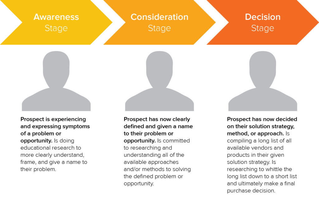
Image Source: Hubspot
The more intelligence our sales team has, the better they can provide the solutions our prospects need. They’ll know what our buyer is looking for and when, exactly, they’re primed to buy.
Fuel for Other Marketing Channels
As powerful as our landing pages are, they’re not the only tools in our inbound marketing toolbox. We still rely on our blog, pay-per-click campaigns, email campaigns, and social media efforts to drive traffic to our website and keep our prospects engaged.
An offer or event launch that leads to a landing page gives us plenty to share through our various marketing channels. When used in our marketing and lead nurturing campaigns, our landing pages will see even higher traffic, engagement, and conversions.
Even better, when we use evergreen content in your offers, we always have something to share. Our older offers will still bring in leads and engagement on our social sharing sites.
Insight into Our Marketing Effectiveness
The more landing pages we create; the more data we’ll amass for our marketing efforts. Tracking and analyzing the metrics associated with our landing pages helps us learn what’s working and what isn’t. We’ll also learn:
- How our various offers compare with one another;
- How visitors and leads convert on our landing pages;
- How our landing pages’ drive business revenue;
Which landing page elements we should test for better optimization.
There is always room to improve your efforts, but we can’t make changes for the better if we don’t know which elements of our landing pages and overall marketing plan need additional attention.
Before we get into testing, let’s talk about what an optimized landing page actually looks like.
Landing page optimization refers to the process of enhancing or improving each element on our landing page to increase conversions. Instead of redesigning the entire page based solely on a hunch, we use data and anecdotal evidence.
Let’s analyze a landing page together to learn about the various elements every landing page should have, from the headline to the submit button.
No Navigation
Once visitors land on our page, we don’t want them to leave until they hand over that information and receive your offer. For that reason, it’s important to keep our navigation options to a minimum. Hide top and side navigation bars from the site so that nothing distracts them from completing the form.
These visitors landed on our site for a reason: to receive the offer our promoted. We’re actually doing them a favor by removing the distractions of links to other pages until they’re able to receive our offer – and we’re doing yourself a favor by reducing our landing page’s bounce rate.
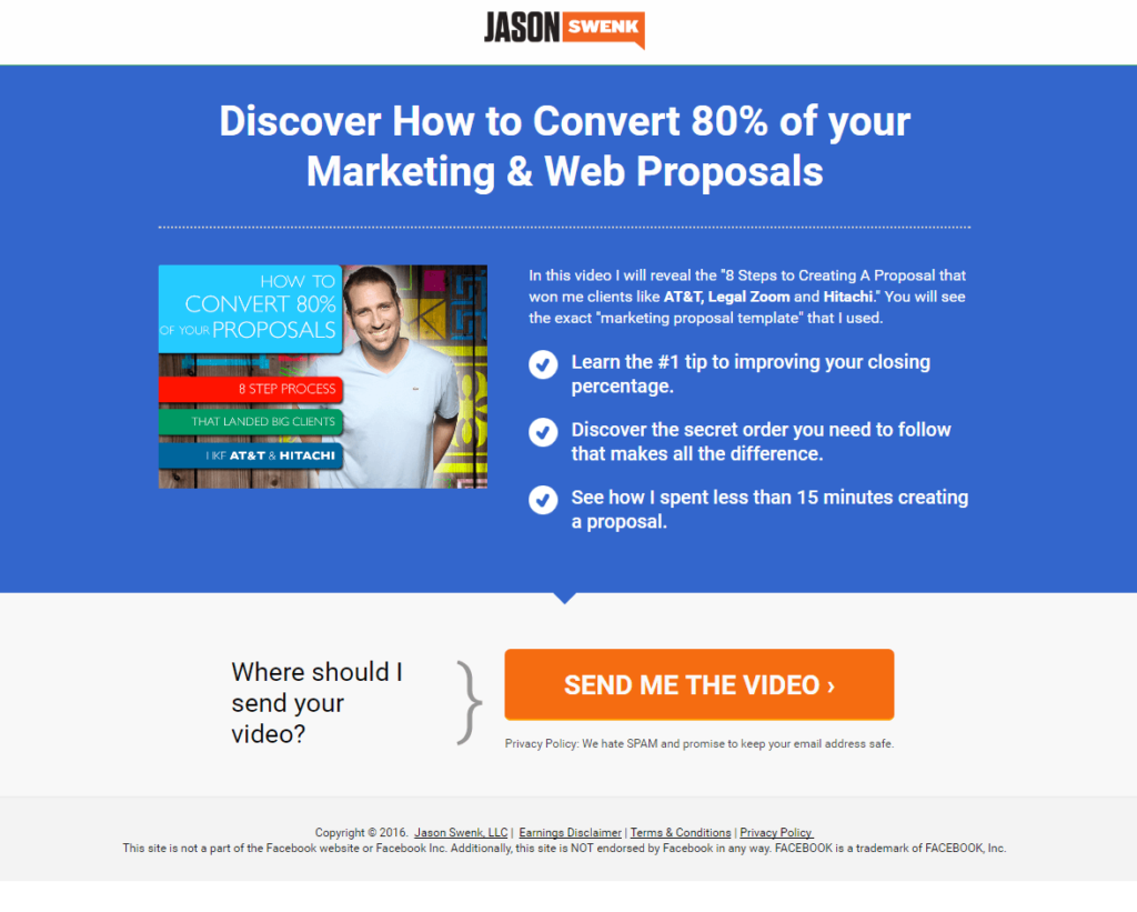
Clear, Concise Headline and Sub heading
The headline is the first thing visitors will see when they land on our page. Whether they stay and engage or navigate away could depend entirely on what our headline says. That’s why it’s critical that we have a clear and concise headline. It should state our offer as clearly as possible. Tell visitors what kind of e-book or workshop or demo they’re signing up for, how much the discount is for, or what product we’re launching. The more information we provide in the headline, the more likely we’ll convert interested prospects.
Here are a few examples of clear, concise headlines:
- “Sign up for your free account”
- “Work Smarter with Evernote: Online Workshop”
- “Get our tips straight to your inbox and become a better manager.”
A subheading under our main headline can provide more information about the benefits of our offer. This also serves as our landing page’s value proposition: What does this offer bring to our buyers that they can’t get anywhere else? What makes it valuable to our visitor? We can’t fit all of that information into a headline, so fortunately, we get a second chance.
Here are a few examples of headlines with great sub headers:
- “The Conversion Collection: Generate Even More Leads from Your Blog”
- “Money Matters: Your Guide for Financial Security”
- “Get a Free Strategic Analysis of Your SEO & Content Marketing”
- “Watch a demo of HubSpot’s software: See how you can increase your company’s revenue with our all-in-one marketing platform.”
- “Learn the science behind the art of winemaking: Fill out this form and we’ll enroll you in a free sample lesson on sparkling wine”

Value Statements
While our headline and a sub header should give visitors a pretty great idea of the value of our offer, for some visitors, those alone won’t be enough to motivate them to fill in their contact information on a form. A few sentences or bullet points that clearly state what the offer includes and why it’s valuable could make all the difference here.
In a brief and clear list, anticipate and answer any questions visitors might have about the offer. What does our visitor stand to gain from the offer? Will they learn more about our services? Does our offer teach them various ways to use your product? Can they save money or receive a free trial?
Be sure that we break up large blocks of text and use bullet points to draw eyes to the most important takeaways.
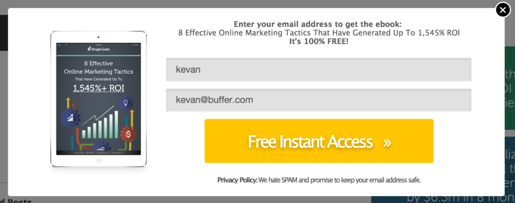
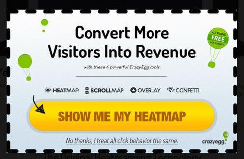
Relevant Image
In addition to creating a great offer and writing a great headline and value statements, compelling imagery will help us grab our visitors’ attention. After all, a picture says a thousand words. Of course, that image should be relevant and match the offer so that buyers aren’t confused by the final asset.
A great image for our offer might be the cover image of your e-book, a screenshot of the webinar or video, or a graphic design stating the discount or sale available. This gives landing page visitors something visual to match the text they read. That image will stick with them longer than any of the copy.
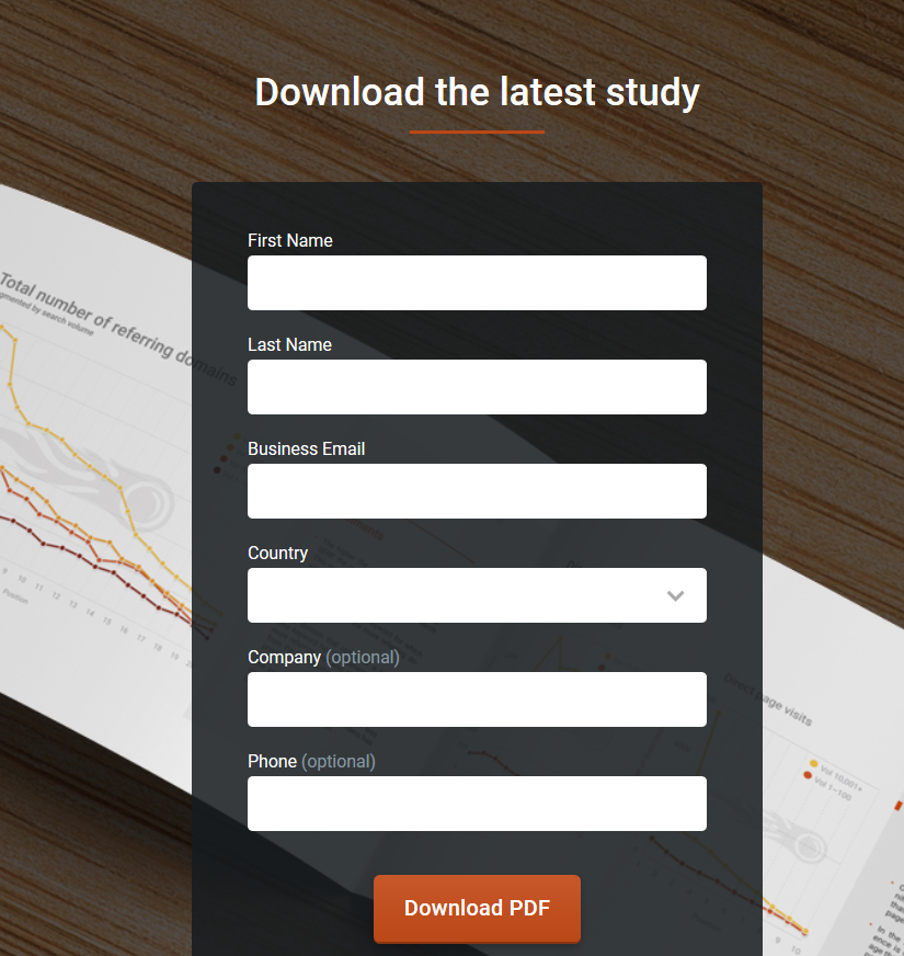
Lead Capture Form
The lead capture form is without a doubt the most crucial element of our landing page.
Your form is how our visitors will supply information in exchange for our offer. Without this form, we cannot collect the necessary data that helps us market to potential buyers.
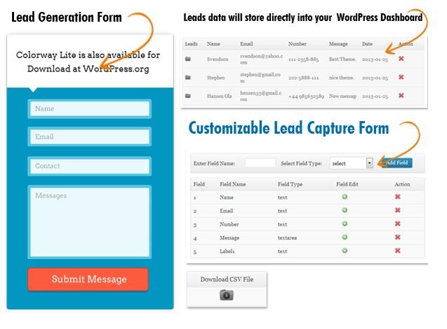
Naturally as marketers or salespeople, we want to ask for lots of information from visitors. Visitors, on the other hand, want to spend as little time as possible filling out the landing page to get access to the offer they’re trying to get. That means the number of fields on a landing page is a balancing act between user experience and business needs.
The length of our form also inevitably leads to a tradeoff between the quantity and quality of the leads we generate. A shorter form usually means more people will be willing to fill it out, so we’ll generate more leads. But the quality of the leads will be higher when visitors are willing to fill out more forms fields and provide us with more information about themselves and what they’re looking for. Therefore, shorter forms usually result in more leads, and longer forms will result in fewer, but higher quality leads.
It all boils down to our goals: If our priority is more leads regardless of quality, then minimize the number of form fields. If our priority is more high quality leads, then ask for the specific information that our sales reps need to qualify our leads.
Remember the progressive profiling we talked about in Chapter 2? If we have marketing software that lets you adjust your forms’ questions and length based on whether a visitor has already completed a form of ours in the past, we’ll be able to progressively collect valuable new information while keeping our forms short and easy to complete.
So a first-time visitor might see this form:
But a returning visitor might see this form:
Privacy Policy
Any time we request contact information from a visitor to our website, we should provide an explanation about how we plan to use email addresses and phone numbers. It’s just the right thing to do. After all, it’s not at all unheard of for unscrupulous companies to sell people’s information to the highest bidder.
Lack of a privacy policy could discourage visitors from filling out our forms. Include a short line or two reassuring visitors that we won’t sell their information:
Even a simple link to our privacy policy, could be enough to give our prospects some peace of mind:
Of course, before we promise that we won’t sell their email addresses, make sure our company actually won’t. We need to be able to keep our promises to earn a reputation for credibility among our customers and potential customers.
Compelling Button Copy
The copy on our button is what motivates and directs our visitors to take a desired action on our landing page. That’s why a word like “submit” is a bad idea. Not only is it too vague, but no one wants to “submit” to anything. We need to be more specific than that.
Instead, tell buyers exactly what they’re getting when they click that button. Use specific words like “Download Now” or “Download Your EBooks” for an e-book or white paper; something like “Access Your Coupon” for a discount offer; and “Sign Up for Free” for newsletters or free trials.
Social Proof
We can tell visitors as much as we’d like how good our offer is, but the truth is, it’s more compelling for them to hear about it from someone else. This is where social proof comes in.
Social proof is the positive influence created when a person finds out that others are doing something. If site visitors see that people who have consumed the offer are speaking positively about it, they are more likely to think positively about it, too, and therefore might be more likely to fill out the form and convert to a lead.
Social proof can take the form of:
- Customer testimonials: short quotes from happy customers
- Case studies
- Embedded social media posts
- Number of downloads, users, and so on.
Your Landing Page Checklist
Now that we’ve learned about landing page, here’s a landing page checklist we can run through every time we build a new landing page.
- Does our landing page pass the blink test? In other words, will someone know what the offer is, why we’re offering it, and why it’s valuable after only 3-5 seconds?
- Do we have an attention-grabbing headline?
- Do we have a relevant and compelling image?
- Is the copy clear and concise? Does it explain what the offer is and why it’s beneficial?
- Have we removed potential friction and distractions from the page, like external navigation?
- Did we include a privacy policy?
- Did we add social proof?
Testing your Landing Page
The data we collect from our landing pages will actually help we make those and future landing pages more effective. Of course, that means we have to pay attention to our metrics. No one likes poring over spreadsheets, but it’s worth the trouble if we can bring in even more leads, right?
Here’s what you should learn from the data you examine:
- Where visitors clicked on our page
- How long visitors stayed on your page
- How many visitors converted to lead
Each of these metrics can be improved upon, but testing it will be the best way of discovering what works and what doesn’t. Instead of wondering if your headline is compelling enough, put it to the test against a different headline to see which leads to a higher conversion rate. Even the smallest tweaks can significantly affect the number of leads we can generate.
Which Elements Should I Test?
Not all variables on your landing page will result in higher conversions. Some are actually more worthy of your time than others. If you’re wondering if you should change the background color on the page or change the copy, you’ll quickly learn with A/B testing which is more beneficial to your bottom line.
First, let’s determine which of the elements you can optimize through A/B testing on your landing page.
Offer Type
We may need to test our own offers to determine which types work better for our customers wherever they may be on their journey.
Keep in mind that a balanced mix of content is important so that we’re reaching people at every stage of their buying journey. If we have plenty of content for first-time visitors (like checklists and e-books), but drop the ball on offers that will convert those visitors into actual customers (like product demos and free trials), then our landing pages won’t do much to help us.
Copy
The copy on our landing page can be broken down into various elements, from the headlines to button copy. Each of these smaller pieces can be tested to achieve better results – just make sure we’re testing them one at a time, otherwise we won’t know which copy change yielded the better results.
One test we can start with is short, snappy copy versus a long-form article on the landing page. We might find our audience likes longer copy, while some industries benefit from short, to-the-point information. And this may differ by the type of offer. We’ve also discovered that hard data and bullet points often work better, but we could discover the opposite through testing.
Form Fields
We’ve already touched on using forms in various ways to reach buyers at different stages in the decision process. This chance to A/B test our forms will help us really hone in on what works best.
For top-of-the-funnel offers like e-books and whitepapers, start with simple contact information. Content and offer forms targeted at folks who are considering making a purchase can ask for more information – but only what we need to help these prospects move further down the funnel. If you’re offering something at the bottom of the funnel (i.e. something for those who are ready to buy but just need a little more convincing), then it’s time to really dig deep for answers that will help us convert that lead into a customer.
Other Add On Elements to check & test
- Headline
- Form Field Names
- Button Color
- Button Size
- Button Copy
- Form headline
- Image
- Use of Video
- Testimonials
Analyzing Your Results
We must track and analyze our results to know what’s working and what isn’t. Some of our metrics will be easier to track that others. For instance, we can see almost immediately how many people clicked through to submit their information. Where things get tricky is comparing the many variables we’ve tested to determine which bring the best results.
Fortunately, we have use A/B Testing Calculator that’ll help us avoid doing complicated math manually. Use that calculator to help we determine the statistical significance of each change we made with just the push of a few buttons.
Measure the Performance of a Landing Page
All the calculators in the world can’t tell us if our pages are performing well or not. It’s up to us to use landing page analytics to determine our reach, impact, engagement, and growth. We’ll start with the easiest to track and go from there by measuring four important metrics.
Page Views
We’ll probably watch this number obsessively after launching an offer, so tracking views won’t be too hard. It’s important to note that this number tells us much more than simply how many people stopped by our landing page.
First, we’ll know if our page was promoted well. Would changes to our promotion efforts bring in more page views? Does our number jump after A/B testing different elements? What’s the ratio between page visits and conversions? That’s where we really start learning something about our landing page.
View-to-Submission Rate
Once we know how many people have visited our landing page, we’ll want to know how many completed submitted contact information. Keep in mind that several things could affect this ratio, such as the type of offer we’ve presented.
We’ll also want to consider our historical benchmarks to determine what’s working and what’s not. Do you know if visitors from different promotional channels, such as email, search, and social media, are more or less likely to convert than others? This will help us determine where promotion should occur in the future.
Various segments of our buyer personas may also be more likely to fill out the form on the first visit, too. Some may need to mull things over before returning to get our offer. Still others may not be moved at all by our e-book or discount.
Our timing is also important to note when contemplating our view-to-submission ratio. Evergreen offers on landing pages that rank high for a keyword in search engine results may see a much higher view-to-submission rate than newly launched offers that are seeing more traffic from social media.
Conversion Rate
Our conversion rate can be broken down into two different categories: new and returning. This tells us which offers are better for the top of the funnel—attracting new customers—and which work better for those in the consideration phase or who have already made a purchase.
Total Number of Leads
The total number of leads generated is the big number to look at here. This number lets us know our landing pages are optimized and our offers are compelling to visitors who are unfamiliar with your company or those who have never converted on a form previously.
Conclusion
By now, we should have the basics that we need to build powerful landing pages with a focus on conversion and building relationships with your audience. It’s important to study the landing page optimization often to ensure we’re keeping with the latest best practices and trends so we can maximize our lead potential even on older, evergreen offers.
Never stop working to improve, whether it’s through research, A/B testing, surveys – whatever we need to ensure we’re providing our visitors with the offers and information they need to make decisions about our products and services.
We’re ready to run now, so start bringing in those leads!
I am impressed this article. i want to make landing page for website. can you share me your landing page designing packages.